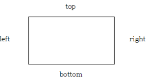
1. 박스 모델 방향
속성을 지정할 때
top -> right -> bottom -> left의 순서로 적용할 수 있다.
2. 테두리 스타일 border-style
solid, dotted, dashed, double, groove, inset, outset, ridge가 있다.
<!DOCTYPE html>
<html lang="ko">
<head>
    <meta charset="UTF-8">
    <title>테두리 스타일 지정하기</title>
    <style>
        div {
            width:200px;
            height:100px;
            display:inline-block;
			margin:15px;
			text-align: center;     /*글자 가로정렬*/
			font-size:20px;
			line-height:100px;	/*글자 세로정렬*/
			border-width:5px;  /* 테두리 굵기 */
        }
        #box1 {border-style:solid;}
        #box2 {border-style:dotted;}
        #box3 {border-style:dashed;}
    </style>
</head>
<body>
    <div id="box1">실선 테두리</div>
    <div id="box2">점선 테두리</div>
    <div id="box3">짧은 직선 테두리</div>
</body>
</html>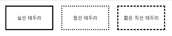
3. 테두리 두께 border-width
px 또는 예약어 thin, medium, thick 사용 가능
<!DOCTYPE html>
<html lang="ko">
<head>
    <meta charset="UTF-8">
    <title>테두리 두께 정하기</title>
    <style>
        div {
            width:200px;
            height:100px;
            display:inline-block;
            margin:20px;
            border-style:solid;
        }
        #box1 {border-width:2px;} /*top, right, bottom, left 모두 같은 값*/
        #box2 {border-width:thick thin;} /*top과bottom은 thick, right와left는 thin*/
        #box3 {border-width:thick thin thin;} /*top right bottom 순서대로 적용, left는 마주보는 right와 같은 값 적용*/
        #box4 {border-width:10px 5px 5px 10px;} /*top right bottom left 순서대로 적용*/
    </style>
</head>
<body>
    <div id="box1"></div>
    <div id="box2"></div>
    <div id="box3"></div>
    <div id="box4"></div>
</body>
</html>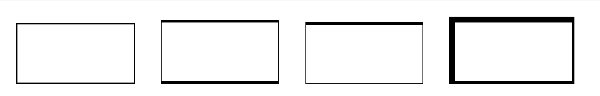
4. 테두리 색상 border-color
border-방향-color로 방향마다 색상 다르게 지정 가능하다.
(방향은 top, right, bottom, left가 있다.)
<!DOCTYPE html>
<html lang="ko">
<head>
    <meta charset="UTF-8">
    <title>테두리 색상 지정하기</title>
    <style>
        div {
            width:200px;
            height:100px;
            display:inline-block;
            margin: 20px;
            border-style:dashed;
            border-width:2px;
        }
        #box1 {border-color:gray;}
        #box2 {
            border-top-color:skyblue; /*border-방향-color*/
            border-left-color:pink;
        }
    </style>
</head>
<body>
    <div id="box1"></div>
    <div id="box2"></div>
</body>
</html>
5. 테두리의 두께, 스타일, 색상 border
top, right, bottom, left의 두께, 스타일, 색상이 같다면
border로 사용 가능하다.
<!DOCTYPE html>
<html lang="ko">
<head>
    <meta charset="UTF-8">
    <title>테두리 스타일</title>
    <style>
        p {
            padding:10px;
            border:3px dotted blue; /*테두리의 두께, 스타일, 색상*/
        }
    </style>
</head>
<body>
    <p>두 번 세 번 피곤하게 자꾸 질문하지마 내 장점이 뭔지 알아 바로 솔직한 거야
        두 번 세 번 피곤하게 자꾸 질문하지마 내 장점이 뭔지 알아 바로 솔직한 거야
        두 번 세 번 피곤하게 자꾸 질문하지마 내 장점이 뭔지 알아 바로 솔직한 거야
    </p>
</body>
</html>
6. 둥근 테두리 border-radius
박스의 모서리를 둥글게 만든다.
px, em의 단위나 %를 사용
원 형태는 너비와 높이를 같게 지정하고
border-radius를 50%로 지정하면 된다.
<!DOCTYPE html>
<html lang="ko">
<head>
    <meta charset="UTF-8">
    <title>둥근 테두리</title>
    <style>
        img {width:400px; height:300px;}
        #round {border-radius:25px;} /*모서리 둥글게*/
        #circle { /*원 형태*/
            width:300px;
            height:300px;
            border-radius:50%;
        }
    </style>
</head>
<body>
    <img src="images/ddung.png">
    <img id="round" src="images/ddung.png">
    <img id="circle" src="images/ddung.png">
</body>
</html>
+ 꼭짓점마다 따로 둥글게 처리하려면 border-방향-radius로 지정하면 된다.
(방향은 top-left, top-right, bottom-left, bottom-right 4개가 있다.)
border-top-left-radius: 20px;
border-bottom-right-radius: 100px;
더보기
Do it! HTML+CSS+자바스크립트 웹 표준의 정석 교재를 참고하여 작성했다.